The right to the city is an evolving concept. Currently, it is related to accessibility, inclusion, sustainability and safety in cities; design is a tool that can help to apply them. This article recounts my journey in the Mexico City subway, to demonstrate precisely how design can create accessible spaces and destinations within the reach of all people, regardless of language, age or physical condition.
“We share the ideal of a city for all, referring to equality in the use and enjoyment of cities and human settlements and seeking to promote inclusiveness and to ensure that all inhabitants, both present and future generations, without discrimination of any kind, can create just, safe, healthy, accessible, affordable, resilient and sustainable cities and human settlements and dwell in them (…)”
(New Urban Agenda by ONU Habitat, 11th principle)
The right to the city as a philosophy is more than 50 years old. It was proposed by Henri Lefebvre, a French intellectual, follower of Marx, Hegel and Nietzsche, whose work focused on the critique of society and the search for new forms of political and social organization (Purcell, 2014).
In his book “Le droit à la ville“, Lefebvre put forward an idea opposed to the industrial and capitalist cities that were growing rapidly in the 1960s. He suggested a social reconstruction, where the urban space could be occupied by all the people who live in the city, because as inhabitants they are also owners of that space.
For Lefebvre, then, the “right to the city” consisted fundamentally in guaranteeing the “right to urban life”, to fill the space in which you live with flows, relationships and experiences. In short, the right to appropriate the city and to build it collectively from everyday life and social and cultural practices.
Right to the city as a human right
Lefebvre’s philosophy has a social conception of the city. If translated into physical space, it can be understood as the fight against private property and the creation of public space: squares, parks and places for people. Under this approach, and linked to human rights, a new concept of the right to the city has emerged, promoted by the UN.
Published in 2016, in the New Urban Agenda, the right to the city aims to make the communities in which we live fairer, safer and more accessible to all people. It aligns with the SDGs (Sustainable Development Goals), specifically SDG 11 (Sustainable Cities and Communities), and states the following:
A fair, safe and accessible city
- Is a place without discrimination;
- Is based on gender equality;
- Integrates locals, foreigners, indigenous and minority groups, creating an inclusive citizenship;
- Promotes political participation for decision making, both by government and civil society;
- Fulfills its social functions, i.e., provides access to housing, goods and services to its entire population;
- It has quality public spaces and services;
- Stimulates the creation of diverse and inclusive economies;
- Creates healthy urban-rural linkages, where the environment and natural resources are respected.
Mobility within the right to the city
A large part of the concept of right to the city has to do with people’s access to public services and spaces. The way in which we move around cities and reach these spaces is a key factor in the construction of the right to the city.
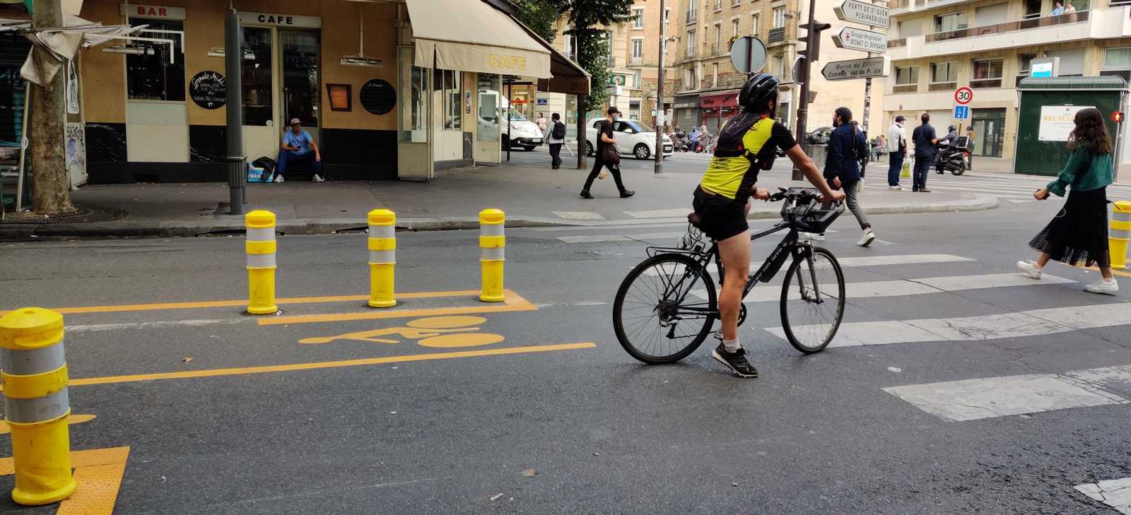
Among the various modes of transport, public transport is a democratic and equitable option. The UN has set as a goal for 2030, “to provide access to safe, affordable, accessible and sustainable transport systems for all and to improve road safety, including through the expansion of public transport“.
This mode of transportation represents an advantage over the automobile, as it can move a larger number of people in a single trip (reducing pollution and road congestion).
According to the Deloitte City Mobility Index from 2019, 25% of people in Paris use public transport for their daily commute. Also, in the United States, it is a means that has increased its use by 28% from 1995 to 2018. In countries such as Mexico, 50.9% of the population uses it (INEGI, 2017), as it is a cheaper option than the car.
Design and accessibility
A means of transport so widely used in cities must offer quality to its users. Some indicators to measure it are those proposed by the ITDP (Institute for Transportation and Development Policy, 2017) in its Transport Oriented Development (TOD) Standard:
- Public transport must have accessible, barrier-free, and safe stations for the entire population;
- A maximum distance of 1.0 km between stations is recommended, and from buildings such as schools, hospitals, or apartments;
- Buses or trains should circulate at least every 5 minutes, with a schedule from 7:00 to 22:00 hours, and guarantee coverage in all areas of a city;
- Finally, it is desirable that they connect with other modes of transport, such as bicycles, pedestrian zones, or public transport of different types.
These features speak to the external aspects of the system. However, navigation within it is an equally important part of getting from one place to another, and this is where design plays a key role. Imagine you are a child, a foreigner or a person who cannot read, and you need to get somewhere using the subway. An efficient public transport network would allow you to do so intuitively. And design has the power to create it.
Design principles for navigating the public transportation system. Mexico City’s subway
Mexico City’s Collective Transportation System (Metro) is an emblematic means of transportation that is almost 52 years old. Built in September 1969, being the seventh in the world, it currently has 195 stations distributed in 12 lines, which moves 5.5 million people daily.
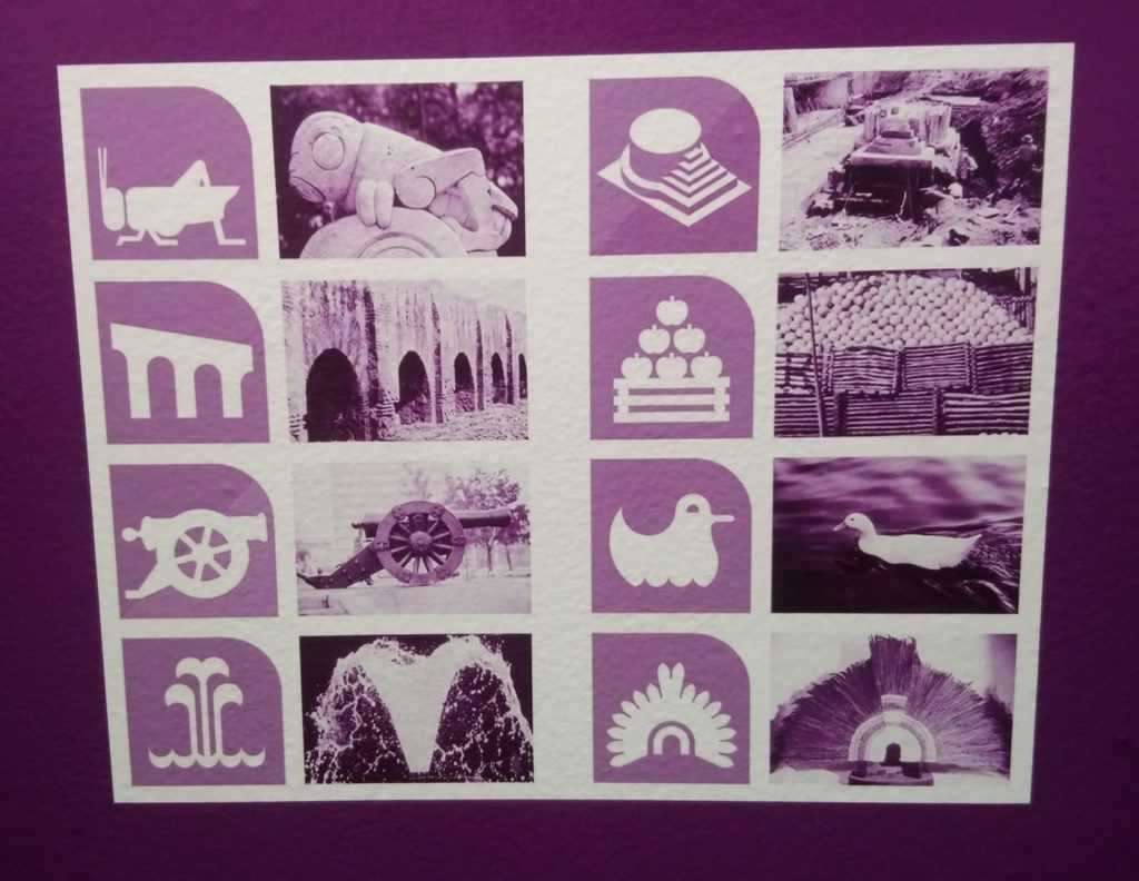
It is a 226-kilometer network that reaches all cardinal points of the city, so having a simple and easy-to-follow navigation system is an essential requirement for its operation. The designer in charge of creating the entire graphic image of the subway was the North American Lance Wyman, who also designed the logo for the 1968 Olympic Games.
The project had the objective of orienting the user within the system. Wyman designed the entire signage, including typographies, indications and symbols for each station, taking for the names geographical, cultural or historical reference of the place. This resulted in a graphic identity that is still in force today, and has become a key element in the image of Mexico City.
Navigating the Mexico City subway
With the premise of testing the subway signaling system, I traveled through 16 stations on 5 different lines. The hypothesis was that the system provides enough information for someone to travel within it, change lines and go to the right direction. My expedition was based on a few questions, from which I found the following answers:
Are subway stations easily identifiable from the street?
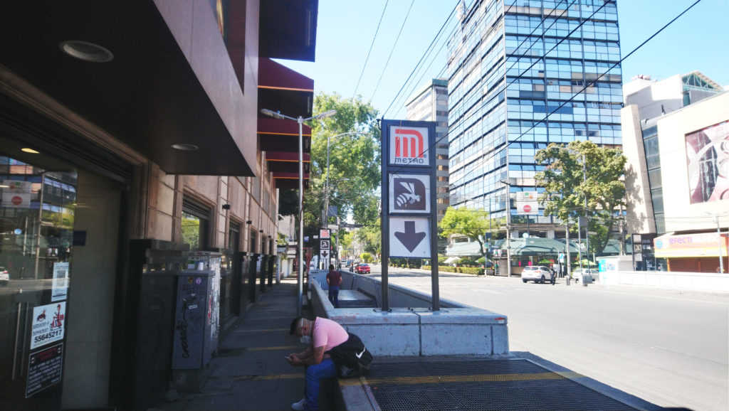
The signage outside Mexico City’s subway stations is visible. It consists of a sign that shows, in the first place, the Metro logo, indicating the type of transport it is. Secondly, the station logo appears, with the color of the line. Each of the 12 lines has a different color. Thirdly, an arrow points to where the station is located. As you approach the station door, another sign also shows the number of the line, along with the written name of the station.
Up to this point, the system is based on three types of language: written, colors and symbols (logo, numbers and arrows). In this way, people who cannot read can find options to identify the stations. For now, the course has been clear.
Is navigation inside the station easy?
When inside a station, you can identify three types of signage:
- Circulation signs: Signal entrances and exits, as well as directions on the platforms;
- Context signs: They can be location maps (neighborhood scale), maps of the entire network and list of stations on the line.
- Services: They point to the ticket office, stores and internet centers.
Context and service signage in the metro is clear. It is based on recognizable icons, such as people climbing stairs, arrows or no trespassing signs. These are universal symbols. In addition, the station name and logo are repeated on several walls, so you always know where you are.
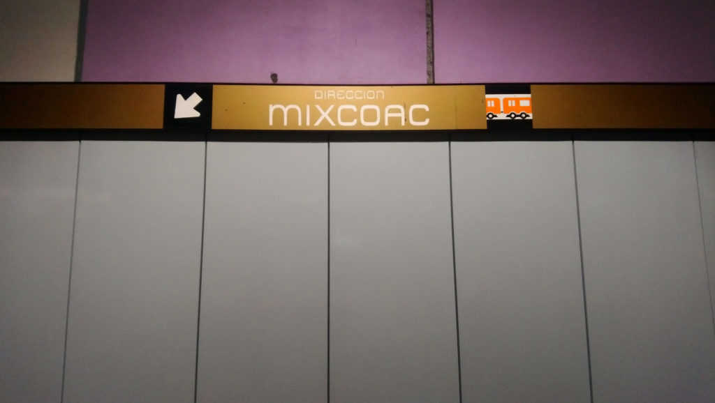
However, there is a problem with the platform addresses. While the name of the destination station (with its color) is indicated on each platform, the logo is not included. This is a disadvantage for people who cannot read or speak the language, as it will be difficult to understand which direction the platform trains travel.
Are the line crossings clear?
The sufficiency of network maps at stations provides a lot of information about the directions people should take. There are several maps within the station, as well as listings of next and previous stations; in this way, people can identify crossings between lines.
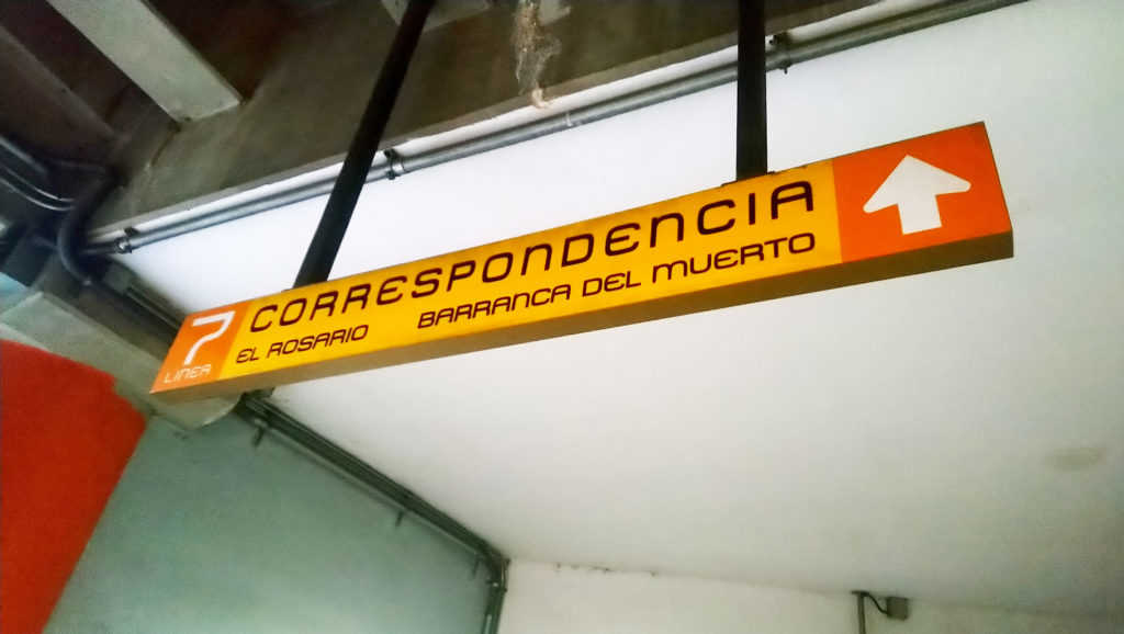
However, like the directional signs on the platforms, the line crossings omit the use of logos. Line crossing signs follow a clear design: they are yellow rectangular signs, accompanied by a white letter C (Correspondence). They include a line in the color of the line to which the station connects, and an arrow indicating the direction. They are apparently simple to understand, and are visible at any point along the route.
The omission of the logo, again, makes them difficult to understand for people who cannot read or speak the language. These people would have to be guided by the arrows, arrive at the platform and observe the identification sign on it. These do contain the logo, but if the person made a mistake, they would have to turn around and go to the opposite platform.
What information is available about the environment surrounding the station?
About the context outside the station, two types of information are provided: points of interest and other modes of transportation.
The points of interest are shown through neighborhood level maps containing basic iconography, such as banks, hospitals and schools, accompanied by the station logo, so they are clear in general.
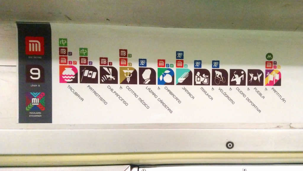
As for modes of transport, a diagram is used showing all the stations of the line with their logo. Above each logo, symbols of other transportation systems are added, as well as a number indicating which line of that transportation it is (and which color). This is a great advantage, since it allows people to plan their trips according to the information they know exists outside.
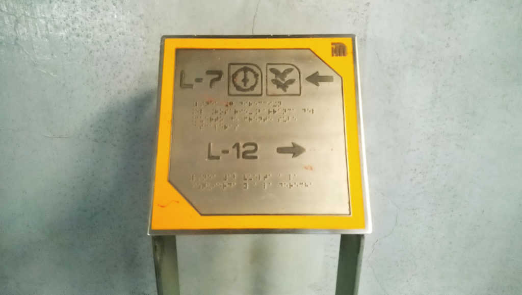
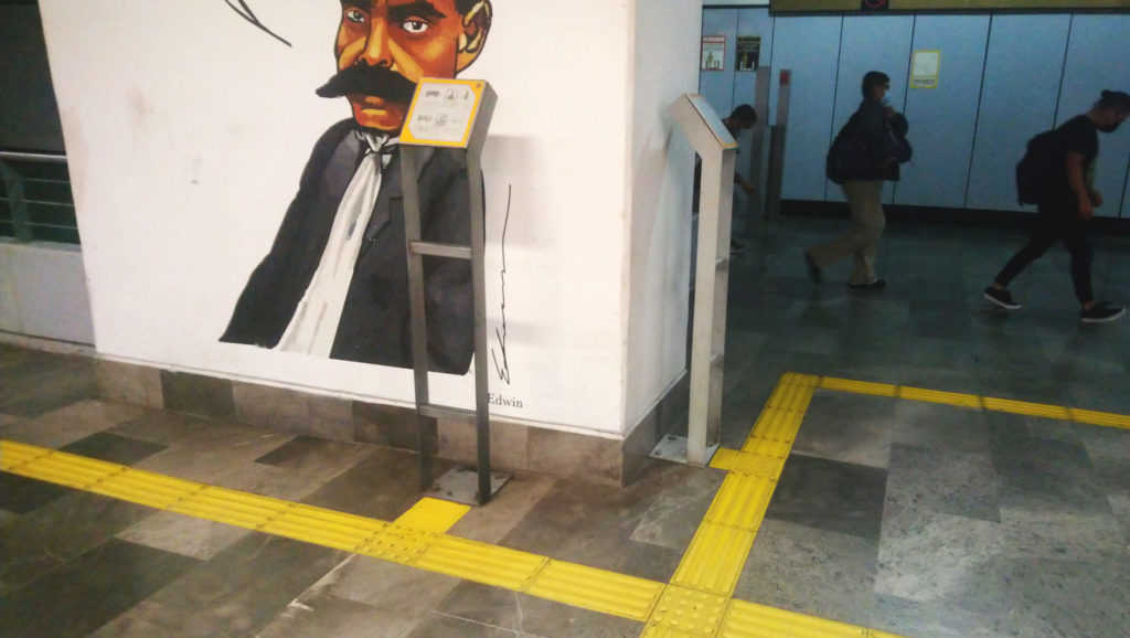
Can a blind person move freely within the system?
The efficiency of a transportation system is really put to the test when it attempts to serve people with disabilities. If it is functional for them, it is an inclusive system, and it is functional for everyone.
In the case of the Mexico City subway, there are some good practices that have been implemented over time in station refurbishments.
Currently, there are metal plaques with Braille language, containing station logos and directional arrows. These plaques are connected to the station entrance by means of tactile guides. The guides also direct to the elevators and safety lines on the platforms. These elements represent a big step towards inclusive public transport, but there are still many stations that are not accessible.
Lessons and conclusions
My trip through the Mexico City subway left me with a series of reflections. I have condensed them to formulate these design principles:
An efficient and inclusive public transportation signaling system:
- Uses a universal language, based on shapes, colors or symbols that are recognizable to all people;
- Uses simple typographies, with simple geometries; in contrasting colors and visible sizes;
- Provides information in all its spaces and corridors; it becomes a resource to reach your destination without setbacks;
- Provides information about its context, because it knows that it is not an isolated element of the city;
- Knows that children are also traveling in it, so it uses signs at different heights and very eye-catching;
- Think of all your users, regardless of the language they speak or the capabilities they have;
- Protects people and creates safe routes for all, regardless of age, gender, ethnicity, or physical condition;
- And, lastly, it creates spaces where people feel free and independent.
Give it a try. Take a ride on public transportation and see if you can ride it freely. I did it in Mexico City but you can do it anywhere. Let’s think about those for whom it is not so easy. Let’s help to build little by little the right to the city.